Skin Tone vs. Undertone: What’s Actually Different
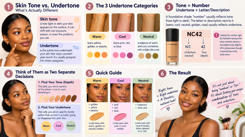
Skin tone is how light or dark your skin appears on the surface. It can shift with sun exposure, season, or even the products you use.
Undertone is the subtle hue underneath the skin that stays constant year-round. It’s usually grouped into three categories:
- Warm — leans yellow, golden, or peachy
- Cool — leans pink, red, or blue
- Neutral — a balance of warm and cool, sometimes with a slight olive cast
A foundation shade “number” usually reflects tone (how light or dark). The letter or description next to it (warm, cool, neutral, golden, rose) usually reflects undertone. Getting the number right but the letter wrong is the most common reason a foundation looks slightly off in photos even though it seemed fine in the store mirror.
It helps to think of these as two separate shopping decisions rather than one. Depth tells you which section of the shade range to start browsing in. Undertone tells you which specific bottle within that section is actually going to disappear into your skin. Skipping the undertone step and just going by “I’m medium” or “I’m fair” is why so many people end up with two or three half-used foundation bottles in a drawer.
How to Figure Out Your Undertone at Home
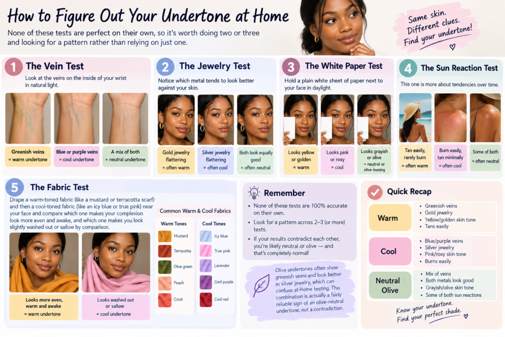
None of these tests are perfect on their own, so it’s worth doing two or three and looking for a pattern rather than relying on just one.
The Vein Test
Look at the veins on the inside of your wrist in natural light.
- Greenish veins usually suggest a warm undertone
- Blue or purple veins usually suggest a cool undertone
- A mix of both, or veins that are hard to categorize, often points to neutral
The Jewelry Test
Notice which metal tends to look better against your skin.
- Gold jewelry flattering → often warm
- Silver jewelry flattering → often cool
- Both look equally good → often neutral
The White Paper Test
Hold a plain white sheet of paper next to your face in daylight.
- Skin looks yellow or golden by comparison → warm
- Skin looks pink or rosy by comparison → cool
- Skin looks grayish or olive → often neutral or olive-leaning
The Sun Reaction Test
This one is more about tendencies over time.
- Tan easily, rarely burn → often warm
- Burn easily, tan minimally → often cool
- Some of both → often neutral
The Fabric Test
This one is less commonly mentioned but can help break a tie between the other tests. Drape a warm-toned fabric (like a mustard or terracotta scarf) and then a cool-toned fabric (like an icy blue or true pink) near your face and compare which one makes your complexion look more even and awake, and which one makes you look slightly washed out or sallow by comparison. People often find this test easier to judge than the paper test because clothing colors are more saturated and the contrast is easier to see.
If your results genuinely contradict each other across all these tests, that’s common — a lot of people are neutral or olive, which doesn’t fit neatly into “warm” or “cool” marketing categories. Olive undertones in particular tend to show greenish veins and look better in silver jewelry, which confuses a lot of at-home testing because it seems to send mixed signals. That combination is actually a fairly reliable sign of an olive-neutral undertone rather than a contradiction to resolve.
How to Test a Foundation Shade Correctly
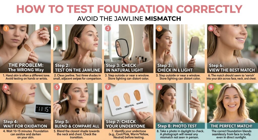
Even with the right undertone identified, the testing method matters as much as the product.
- Test on the jawline, not the hand or wrist. Hand skin is often a different tone than facial skin.
- Apply three shades in a thin stripe rather than one. Comparing side by side makes the correct match much easier to spot than judging a single swipe in isolation.
- Check in natural daylight, away from store lighting, which is frequently yellow-toned or overly bright and can distort how a shade reads.
- Wait 10–15 minutes before deciding. Many foundations oxidize slightly after application and can darken or shift undertone once they’ve settled.
- Check the shade against your neck and chest, not just your face, since foundation that stops at the jawline is one of the most common giveaways of a mismatch.
- Go without makeup for a few minutes beforehand. Testing over old foundation, tinted moisturizer, or heavy skincare with SPF can distort how a new shade reads against your actual skin.
- Take a photo in daylight before deciding. A shade that blends well to the naked eye can still separate visibly in a photo, and it’s easier to catch a mismatch on a screen than in a small mirror.
Common Mistakes People Make When Matching Foundation
- Matching to the face alone without checking the neck, which creates a visible line of demarcation
- Shopping only under indoor lighting, which almost always misrepresents undertone
- Assuming warm/cool is fixed by ethnicity or skin depth — undertone varies independently of how light or dark someone’s skin is
- Not accounting for oxidation, leading to a shade that looked right at checkout but darkens noticeably by midday
- Choosing a shade one tone lighter “to look brighter” — this usually creates a mask-like effect rather than a natural glow
- Ignoring finish — a dewy finish and a matte finish of the exact same shade number can look different once applied, because finish affects how light reflects off the skin
- Buying full-size before sampling. Many brands sell shade-matched sample sizes or offer testers precisely because online color swatches are unreliable across different screens and monitors.
- Assuming one brand’s “warm 3” matches another brand’s “warm 3”. Shade naming and numbering isn’t standardized across brands, so a number or label that worked well in one line doesn’t guarantee the same result in another.
Foundation Formula and Finish: Why It Affects the Match
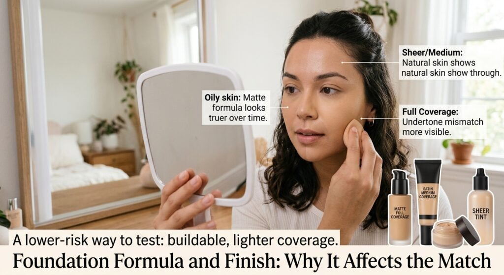
Shade accuracy isn’t only about color — it’s also about how a formula behaves on your specific skin.
- Oily skin tends to make matte and long-wear formulas look truer over time, since excess oil can make dewy formulas shift or slide.
- Dry skin often shows patchiness with matte, full-coverage formulas, which can make an otherwise correct shade look uneven or gray in dry patches.
- Combination skin usually does best with a satin or “natural” finish that doesn’t emphasize oil in the T-zone or dryness on the cheeks.
- Mature skin often benefits from lighter, buildable coverage, since heavier formulas can settle into fine lines and distort the color in those areas.
Coverage level plays a role too. A full-coverage formula sits more densely on the skin, which means any undertone mismatch is more visible and harder to correct with blending. A sheer or medium-coverage formula lets more of your natural skin show through, which can actually make a slightly-off undertone less noticeable. If you’re still not fully confident in your undertone, starting with a buildable, lighter-coverage formula is a lower-risk way to test before committing to a heavier, more pigmented one.
Product Recommendations
The products below are commonly recommended for their range of shades or their approach to undertone matching. Exact pricing, current ratings, and available shades should always be double-checked on the product’s Amazon listing before buying, since these details change over time.
Fenty Beauty Pro Filt’r Soft Matte Longwear Foundation

Best For: Readers with oily to combination skin who want a well-known formula with an unusually broad shade range, including many deeper and olive-leaning options that are harder to find elsewhere.
Why Consider It: This foundation helped set a new industry standard for shade inclusivity, and it’s specifically formulated with a matte, long-wear finish that tends to hold up well through oil and humidity.
Pros:
- Wide shade range, including many undertone variations within each depth
- Long-wearing, matte finish that resists early breakdown on oily skin
- Buildable from light to fuller coverage
Cons:
- Matte finish can look flat or drying on very dry skin
- Some shades may need mixing for exact undertone matches, since options are dense but not infinite
What to Consider Before Buying: Check the shade finder or swatches under natural light rather than product photos, since screen color rendering varies.
Verdict for This Specific Use: A reasonable option for people who’ve struggled to find their undertone in mainstream drugstore ranges and who have normal-to-oily skin.
L’Oréal True Match Foundation

Best For: Readers who want a budget-friendly option that’s specifically built around a warm/cool/neutral naming system, making the undertone-matching process more intuitive.
Why Consider It: The shade naming convention itself (labeling shades warm, cool, or neutral rather than just numbered) makes it easier for beginners to shop by undertone rather than guessing from a swatch alone.
Pros:
- Affordable relative to prestige alternatives
- Undertone-first naming system simplifies shade selection
- Lightweight, natural finish suitable for everyday wear
Cons:
- Coverage is more sheer-to-medium, so it may not fully suit someone wanting full coverage
- Longevity may be shorter than longer-wear formulas, especially on oily skin
What to Consider Before Buying: If you have significant discoloration or want a matte finish, this may need a setting powder or primer layered on top.
Verdict for This Specific Use: Good starting point for someone newer to undertone matching who wants an accessible price point.
Maybelline Fit Me Matte + Poreless Foundation

Best For: Budget-conscious shoppers with oily or combination skin who want a straightforward matte finish.
Why Consider It: It’s a widely available drugstore staple with a broad shade range for its price point, and the matte finish is designed to reduce the appearance of enlarged pores and shine.
Pros:
- Very affordable
- Decent shade range for a drugstore product
- Mattifying without feeling overly heavy for a budget formula
Cons:
- Matte finish can accentuate dry patches
- Coverage is buildable but not designed for heavy full-coverage needs
What to Consider Before Buying: If your skin leans dry, consider pairing it with a hydrating primer rather than skipping one.
Verdict for This Specific Use: A reasonable pick for readers who want to test undertone theory without a big financial commitment.
IT Cosmetics CC+ Cream with SPF

Best For: Readers with sensitive or mature skin who want lighter, more skincare-like coverage along with sun protection built in.
Why Consider It: It’s marketed as a color-correcting formula, meaning it’s designed to even out redness and discoloration rather than just sit as a flat layer of color, which can make undertone mismatches less obvious than a straight matte foundation would.
Pros:
- Includes broad-spectrum SPF, reducing the need for a separate sunscreen step
- Lighter, more skin-like finish
- Often well tolerated by sensitive skin, though patch testing is still recommended
Cons:
- Coverage is more moderate and won’t fully conceal deeper discoloration or blemishes
- SPF content means it may not be ideal for flash photography in some formulations, since SPF filters can occasionally cause a slight white cast
What to Consider Before Buying: If you plan to wear it under makeup for photos, test it in advance rather than the day of an event.
Verdict for This Specific Use: Worth considering for readers prioritizing comfort and skincare benefits over heavy coverage.
e.l.f. Flawless Satin Foundation (or similar wide-range budget satin formula)

Best For: Readers with normal to combination skin who want a satin finish at a low price point, especially those still experimenting with undertone before investing in a prestige formula.
Why Consider It: A satin finish sits between matte and dewy, which tends to be more forgiving of small undertone mismatches than a fully matte formula, since it reflects a bit more light and softens harsh lines of demarcation.
Pros:
- Very accessible price point for testing multiple shades
- Satin finish works reasonably well across several skin types
- Easy to layer or build up coverage gradually
Cons:
- Shade range, while decent for the price, is typically not as extensive as prestige lines
- Longevity claims can vary more than higher-priced long-wear formulas
What to Consider Before Buying: Because it’s affordable, this can be a practical choice for buying two adjacent shades to blend a custom match rather than settling for a slightly-off single shade.
Verdict for This Specific Use: A sensible low-risk option for readers who want to practice the testing process described above without a big financial commitment.
Product Comparison Table
| Product | Best For | Key Feature | Main Advantage | Potential Drawback |
|---|---|---|---|---|
| Fenty Beauty Pro Filt’r | Oily/combination skin, deep or olive undertones | Wide shade range | Long-wear, matte finish | Can look flat on dry skin |
| L’Oréal True Match | Beginners, budget shoppers | Undertone-labeled shades | Simplifies undertone shopping | Shorter wear time |
| Maybelline Fit Me Matte + Poreless | Budget shoppers, oily skin | Affordable matte finish | Low cost, decent range | Can emphasize dry patches |
| IT Cosmetics CC+ Cream | Sensitive or mature skin | Color-correcting + SPF | Lighter, skin-like finish | Moderate coverage only |
| e.l.f. Flawless Satin | Testing/experimenting, normal-combination skin | Satin finish, low price | Forgiving of small mismatches | Smaller shade range than prestige lines |
Foundation Matching Tips for Deeper Skin Tones
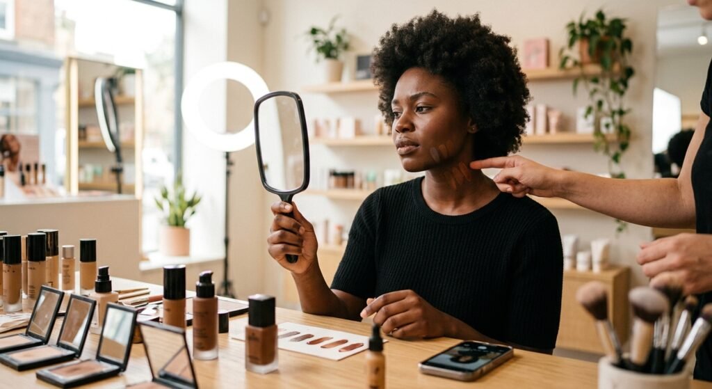
Deeper skin tones are historically underserved by mainstream shade ranges, which means the margin for error is often smaller. A few things to watch for:
- Ashy cast: some formulas are undertested for deeper skin and can oxidize into a grayish tone. Testing in daylight and waiting before purchase decisions helps catch this.
- Limited middle-range shades: brands sometimes have gaps between their darkest few shades, so it’s worth checking whether a specific undertone (not just depth) is well represented before buying.
- Highlighting undertone over depth: for deeper skin, undertone differences (warm caramel vs. cool deep, for example) can be more visually distinct than small changes in depth, so prioritize getting the undertone letter right.
- Watch how a formula photographs, not just how it looks in person. Some formulas that look accurate in daylight pick up a gray or purple cast in flash photography specifically on deeper skin, which is worth checking with a test photo before an event.
Foundation Matching Tips for Very Fair Skin
The opposite end of the shade range has its own common pitfalls. Very fair shade ranges are often narrower than mid-tone ranges, which can force people into a shade that’s technically the lightest available but still slightly too dark or has the wrong undertone. If the lightest shade in a line still looks slightly heavy, mixing a small amount of a lightweight moisturizer or a “fair” shade adjuster in with the foundation can extend a shade lighter without needing to switch products entirely. Fair skin also tends to show pink or red undertones more visibly, so a foundation with even a slightly warm cast can neutralize redness in a way that a true-to-skin cool shade won’t.
How Lighting and Cameras Affect Your Match

A shade that looks correct under warm store lighting can look completely different in daylight or under a phone camera’s flash. Camera flash tends to wash out warm undertones and can make cool or neutral undertones look more accurate than they are in person. If you regularly take photos in a specific setting — an office with fluorescent lighting, for example — it’s worth checking your foundation match under that exact light before buying in full size.
It’s also worth remembering that phone camera software often applies automatic color correction or skin-smoothing filters, which can shift how a foundation shade appears in a photo compared to how it looks to the naked eye. If you’re relying on photos to judge a shade match — your own or an influencer’s swatch video — keep in mind that screen calibration, filters, and compression can all introduce a layer of distortion that has nothing to do with the actual product.
Frequently Asked Questions
Can my undertone change over time?
Undertone itself is generally considered stable, though skin tone (depth) can shift with sun exposure, seasons, or certain skin treatments. If your usual shade suddenly looks off, it’s more often a tone change than an undertone change.
What if I test as “neutral” but nothing matches well?
Neutral and olive undertones are frequently underrepresented in shade ranges built primarily around warm and cool categories. Brands with dedicated olive or neutral shades, or foundations offering shade-mixing options, are usually a better starting point.
Is it normal to need different foundations for summer and winter?
Yes. If your skin tans or tone shifts seasonally, needing a slightly different shade — sometimes even a different undertone label — during summer is common and doesn’t mean your original match was wrong.
Should I trust an online shade-matching quiz?
These can be a helpful starting point, but they’re not a substitute for testing in person or in natural light, since screen calibration and lighting during a photo upload can distort results.
Can I mix two foundation shades to get a better match?
Mixing two adjacent shades from the same formula line is a fairly common and low-risk way to bridge a gap between two “almost right” options, especially for people whose skin tone sits between two standard shades. Mixing across different brands or formulas is less predictable, since ingredients and textures may not blend evenly.
Does foundation shade matter less if I’m only wearing it for a few hours?
Not really — oxidation and lighting shifts can happen within the first hour or two of wear, so a short wear time doesn’t reduce the importance of getting the undertone right, especially if photos are involved.
Conclusion
Getting a foundation match right comes down to separating two things that are often confused: tone (how light or dark) and undertone (the underlying hue). Testing on the jawline instead of the hand, checking in daylight, and waiting for a foundation to oxidize before deciding are simple habits that prevent most common mismatches. From there, choosing a formula suited to your skin type — matte for oily skin, more hydrating or dewy for dry skin — matters just as much as the shade number itself. If you’re still unsure after testing at home, many brands now offer shade-matching services in person or detailed swatch photos online, which can be a useful next step before committing to a full-size purchase.